02
Tideline
A studio site where the architecture is the interface and the interface stays out of the way.
- Client
- A/N Studio
- Year
- 2025
- Role
- Design and front-end
- Deliverables
- Website, CMS, art direction
Website
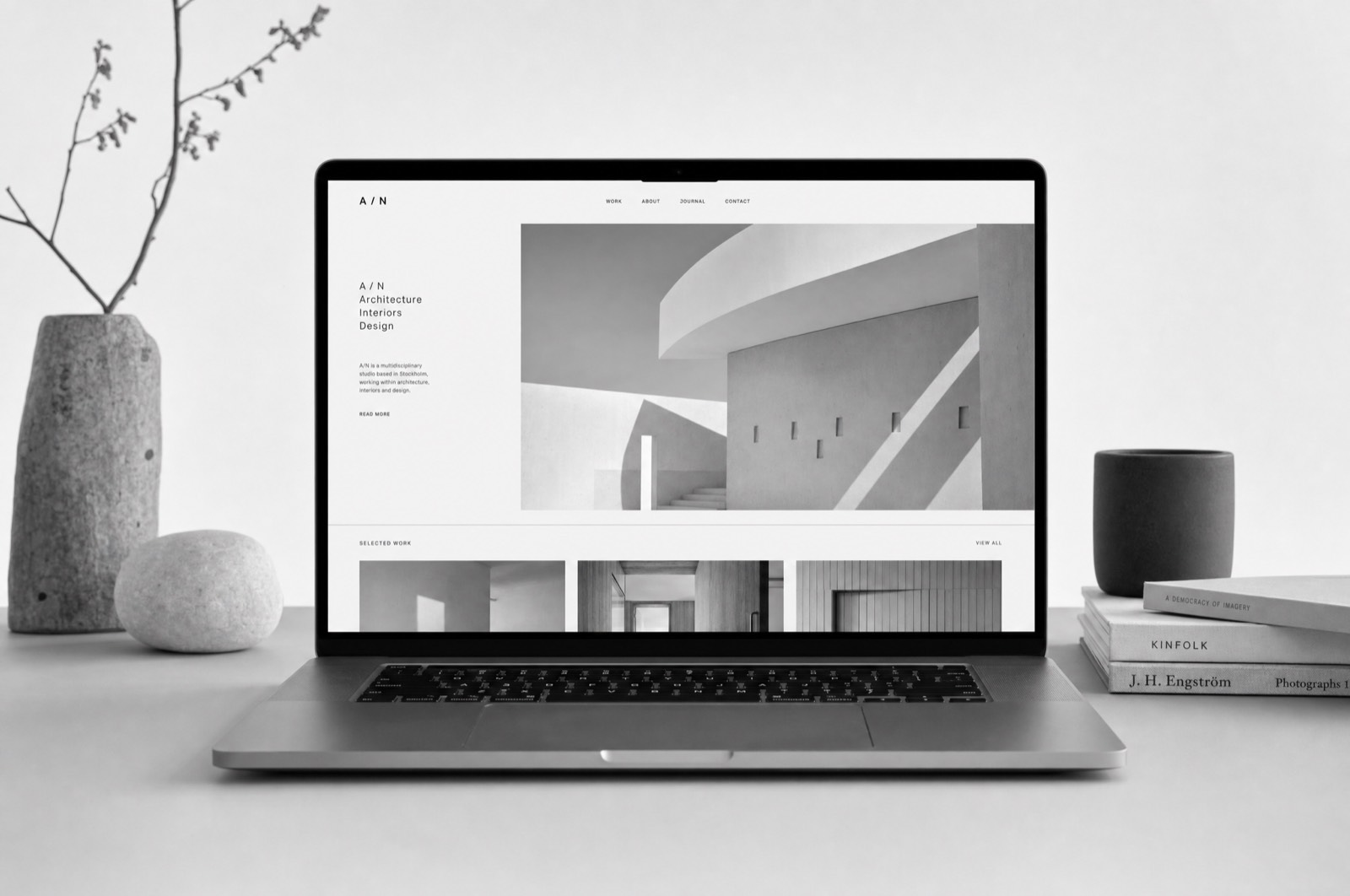
An architecture studio's website has one job: make the buildings look the way they look in person. Everything else on the page is in the way, and most studio sites are ninety per cent in the way.
The photograph sets the grid
The layout is built around a single image at the largest size the viewport allows, with the type set in a narrow column beside it rather than underneath. That column never grows past fifty characters, so the eye returns to the picture rather than settling into reading.
Loading is art direction
Large photography on a slow connection either arrives gracefully or ruins the impression the studio spent a decade earning. Every image ships in three sizes with the aspect ratio reserved in the layout, so nothing reflows and nothing pops in. The page holds its shape from the first frame.
Handover
They add projects themselves now, and the constraint that makes it work is that the CMS accepts exactly one hero image and up to six supporting ones. A studio site fails slowly, by accumulating; the field limits are the design.